Blogs


Quick Links


Difference


Install


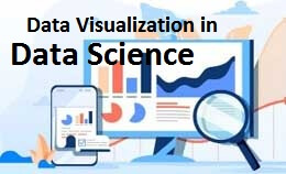
Data visualization in data science tutorial:It is the representation of data or information in a graph, chart, or another visual format. Data visualization will communicate the relationship of the data with images.
It is important because data visualization allows the trend and patterns that are seen.
Machine learning will make it easy to conduct analyses such as predictive analysis, which can then serve as helpful visualizations to present.
The data visualization is important for data scientists and data analysts.
It is also necessary to understand data visualization in any career.
Data visualization will present the data as an image or graphic to make it easier to identify patterns.
Technology will allow the user to interact with data by changing the parameters to see detail and create new insights.Data scientists can uncover incredible and useful information from large datasets they work with, but presenting that information in a way that normal users can easily interpret and understand.
The insights are worthless if we can’t conveyed to a board of directors responsible for making the final decision on how to put the findings to work in the real world.
They are common in your everyday life but often appear in the form of well-known charts and graphs.
There is a combination of multiple visualizations and bits of information which are often referred to as graphics.
It is used to discover unknown facts and trends see visualizations in the form of line charts to display change over time.
Bar and column chart is useful when observing the relationships and making comparisons.
The need for data visualization is because a visual summary of information makes it easier to identify patterns.
The need for data analysis is to get insights that are more valuable when it is visualized.
The data analyst can pull insights from data without visualization as it will be more difficult to communicate without visualization.
The charts and graphs make data find easier if you can identify the patterns without them.
The data visualization can be used in different ways and get into different types in a moment.